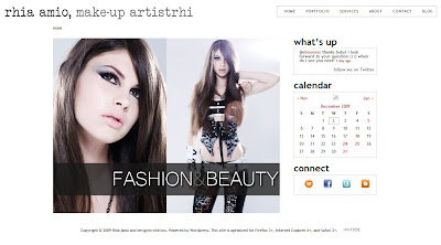
 It’s nearing the one year mark for the artistrhi site, and I was definitely itching for a change! I wanted to adjust the design layout to have a cleaner and brighter aesthetic…and I’m extremely happy with the results, all with the help of Rosie of Design in Rotation (aka my awesome and talented sister!).
To further improve the user experience, you’ll also notice the following changes:
1. Removal of borders and titles within the galleries to let the pictures speak for themselves :)
2. Minimizing the amount of scrolling! Don’t you hate it when you go to a site, but it’s optimized for a different resolution so you have to scroll up and down, AND right and left?!
3. Compatibility with more browser versions, including Internet Explorer 6…which means it will look as it’s supposed to!
4. Icons on the main page that allow you to easily connect via Facebook, Twitter, Blogspot and the new gig at wnetwork!
5. Moving towards uniform branding for ‘artistrhi’ with logo changes on the site, the blog and on rhiaamio.com
I’m always open to suggestions on how the site can be improved. Let me know what you think!

